

Design is like a box of chocolates…
Finishing that famous Forrest Gump sentence, we never really know what we are going to get with design. The reason is that there is so much more to good design than what meets the eye.
So how do we inform people up front what they are going to get? And even better, how do we inform designers of what the user experience of their design is going to be?
It all comes down to our ability to put a number on design quality.
So let’s do that. Here is how.
Assessing and Quantifying The User Experience
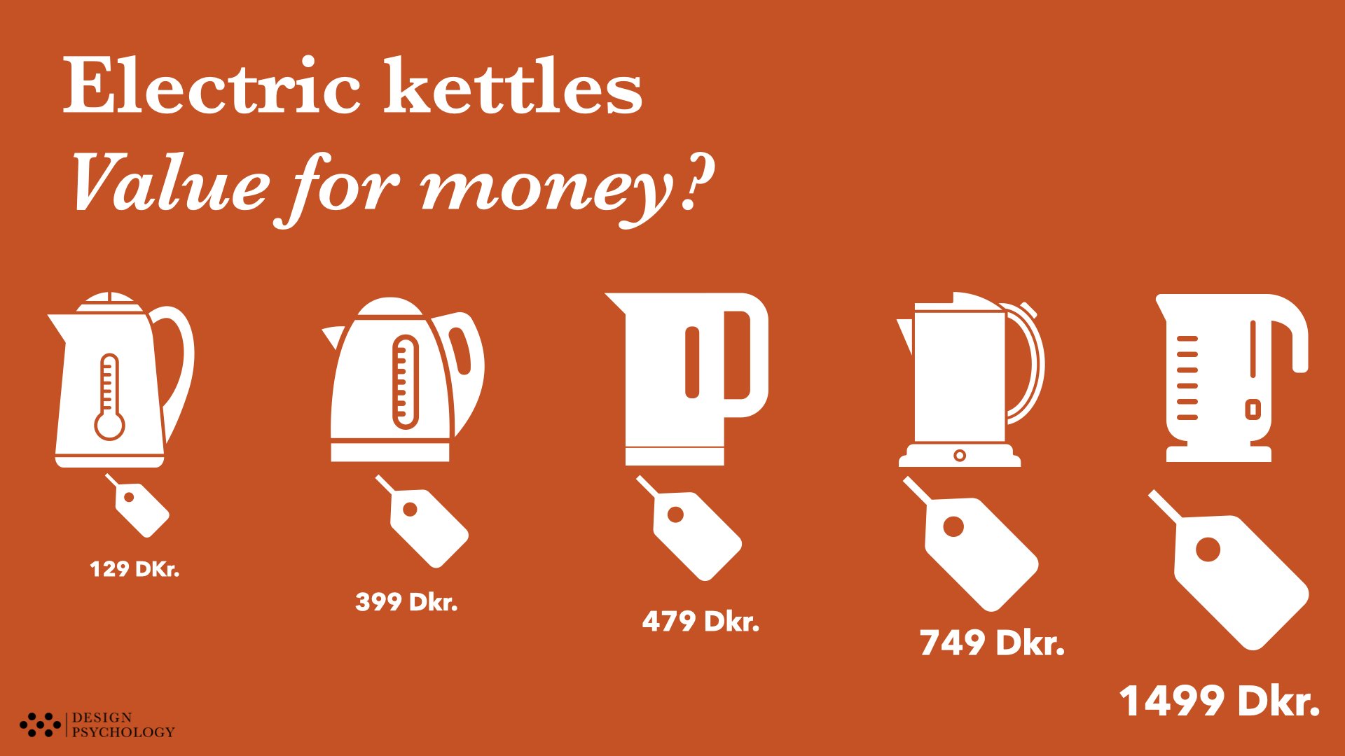
We are going to use electric kettles as a case for how to put a number on design quality. Keep in mind that although we talk about electric kettles, the logic of the “design quality quantification” will apply to any type of design - also yours.
Even though there are many subjective elements to the user experience of a given product, the field of human factors provides us with the tools to help objectively quantify a broad range of qualities that impact the user experience.
This allows us to evaluate the design of a given product, like an electric kettle.
Example: The UX of placing the kettle on its base
When you have filled up the electric kettle with water, you need to place it back on its base, before you can turn it on and start heating the water.
With surprisingly many kettles, this simple step can be a quite poor user experience as it requires an unnecessary amount of precision and coordination to place the kettle exactly right. In fact, it may require a few attempts before the kettle is placed just right in the base. Furthermore, this inconvenience doesn’t go away. It will the same poor experience each and every time you need to place the kettle on the stand.
So let us try an quantify the quality this part of the design.
Take for example the difference between these two designs:

A) Stelton 749,95 DKK

B) Køkkenchef 129 DKK
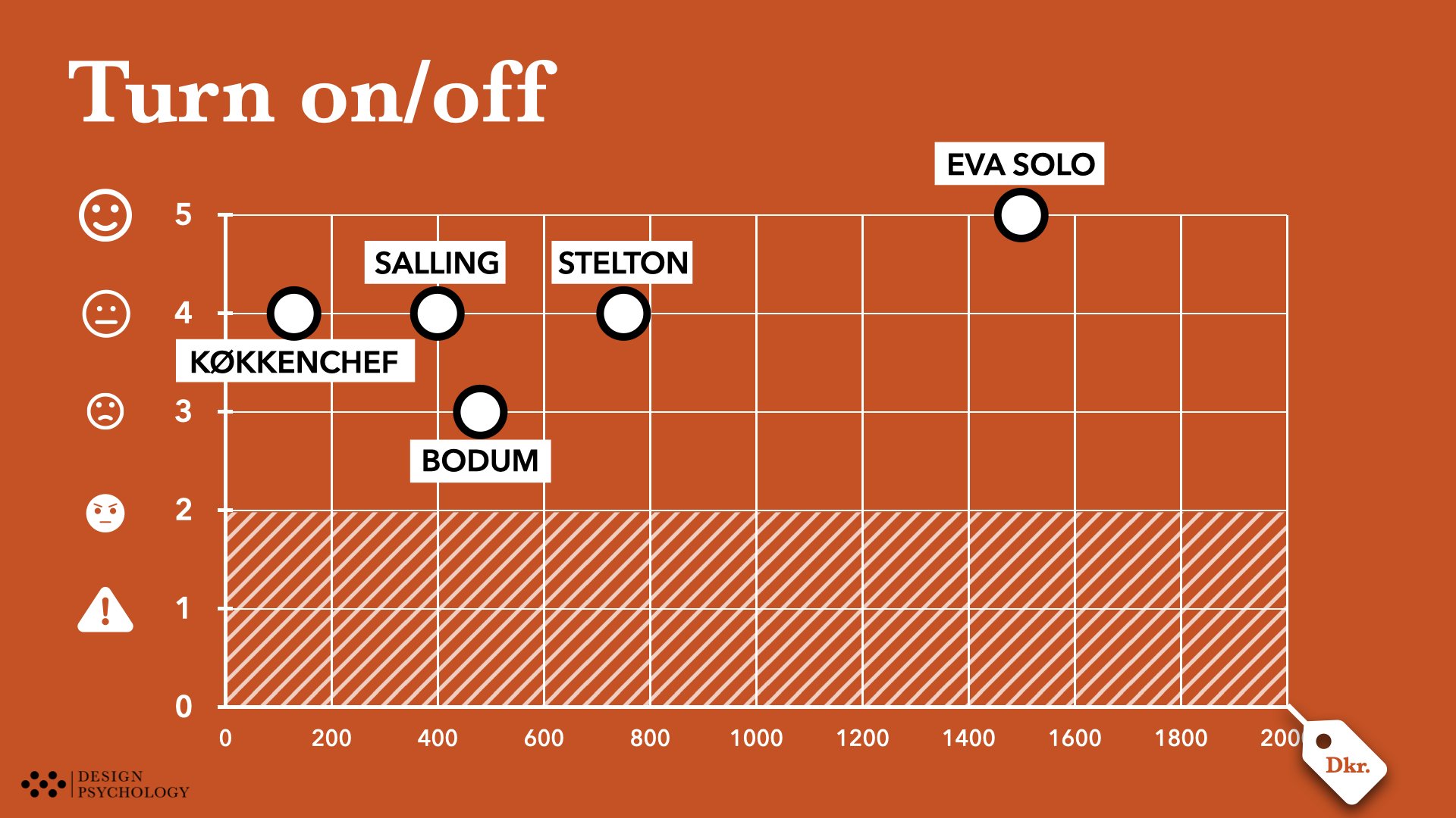
With the first design (the more expensive A), the user needs to place the kettle very precisely within a very narrow margin for error - only about 5 degrees, to succeed.
However with the second design (the quite cheap B), the user has full “rotational freedom” to turn and place down the kettle in any way - all 360 degrees are okay.

The “rotational degree of freedom” during placement basically feeds into how much hassle it is each time you need to place the kettle on the stand. The less hassle, the better the user experience (UX) rating.
This kind of analysis can help us start to assess, quantify and rank different designs with regards to the user experience - all in an objective manner. Objectively, here means that once we have defined the criteria for different UX-scores, anyone should be able to apply those criteria and reach a similar rating (this is also referred to as “inter-rater agreement”).
In the following, we’ll go through our four-step guide for how to evaluate UX design, exemplified by our own internal analysis of the user experience of five different electric kettles.
Electric kettle design quality: 5-point rating scale
In this review we included five different kettles with different price points.

As you can see they vary a lot in price, but (spoiler alert), there were many instances where we found that a higher price, did not result in a better user experience.
Here’s What The Results Looked Like
The results from the design review of the five electric kettles are presented in the slides below. After the slides, we end this article with some reflections on the learnings from this electric kettle review, and what it tells us about product and design reviews in general.
Our Five-Point Rating Scale
When we work with expert rating scales, we need a “resolution” that is practically manageable. That is not too many options to choose from - and not too few. However, scales may differ depending on the type of design. In this case, with electric kettles, we use a five-point scale.
Here is the logic of that scale:
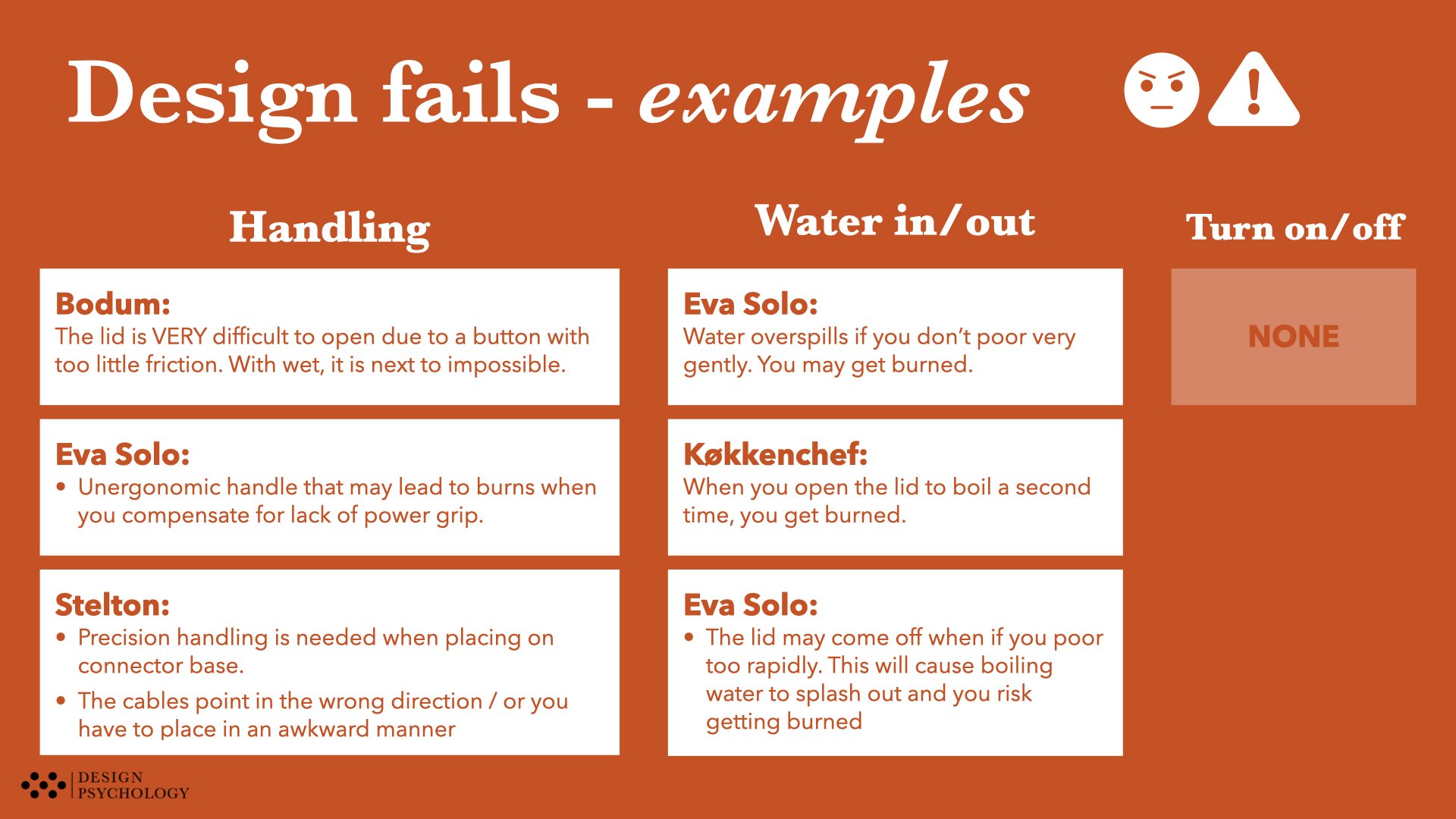
For a product like an electric kettle, you can make user errors and even risk causing harm to yourself (or somebody else). Therefore, the scale includes two lower-end scores of 1 and 2. These scores reflect what can we can argue is a design fail - something that should have been fixed.
You should not buy products with design fails.
This leaves us with a gradient of three scores for us to grade the quality of the design:
The best score (5) is when the design supports optimal perception, cognition and action across all subtasks (and use scenarios - e.g. boiling water for pasta or a cup of tea).
The second-best score (4) is when we have overall good design but with room for some improvement.
The third best score (3) is when we have substantial problems within one or more subtasks.
In the picture below, you find some examples of how the perceptual qualities of the ‘on/off button’ and ‘indicator light’ can be graded after this scale:

Auch… I just burned my finger on the kettle! …AGAIN 😠⚠️
Scores 1 and 2: when design can cause errors and harm
In the rating table, we also have scores 1 and 2. Score 2 is when a design can cause a user error. This could be accidentally spilling water when pouring from the kettle.
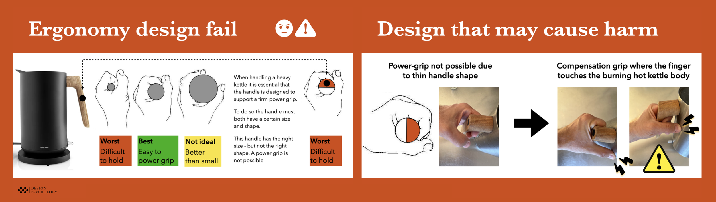
Some design qualities may further lead to the risk of harm to the user. Below is an example of how poor handle ergonomic may cause the user to get burned on the boiling hot kettle. Therefore the score of only 1 will be assigned. This example is illustrated in the picture below.
You can see more examples of design fails (score 1 and 2) in the results slides in the section “Step 4 - Rating”.
This is of course just one example, of the design elements that we reviewed for the five electric kettles.
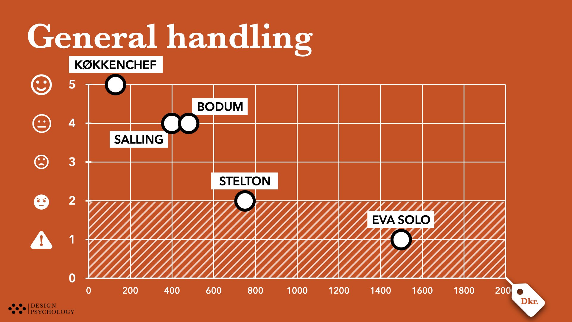
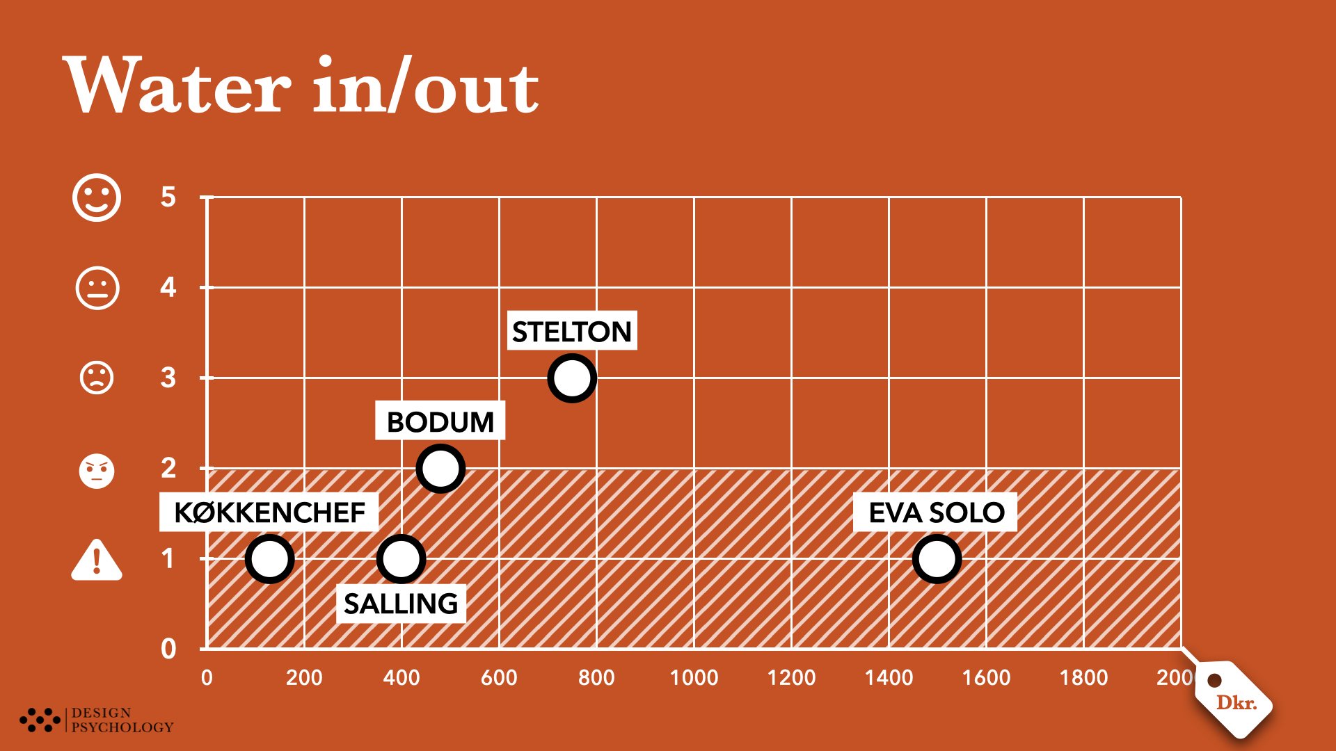
Below you will see a high-level visual overview of all five electric kettles and how they performed on the two tasks and their subtasks. The overview clearly shows that there are multiple design fails scattered across the five products.
Likewise, it also tells us that there are excellent design elements equally scattered across the five kettles.

Learnings From The UX Electric Kettle Analysis
To use the Forrest Gump analogy, the analysis revealed that there are definitely some chocolates you would like to avoid. Also, that the price is not always a good indicator of quality. There were serious user experience problems with the design, both in the cheaper and more expensive kettles.
Here is four of the learnings we draw from the analysis.
Learning 1:
There is no one perfect kettle (in our sample)

The “Franken-Kettle”
There is no clear winner among the five kettles that we reviewed, since they all have critical design flaws that simply should not be there. No matter the price point.
However, there were also good qualities, in all of the kettles. This realisation during our review gave rise to the term “Franken Kettle” to denote that there are really good qualities represented in each kettle design - and that the perfect kettle, would be combination of all of these aspects of good kettle UX.
This translates into a design opportunity to design a new electric kettle where all the design elements integrate the best of the best.
Learning 2:
Try out the product before you buy it
There are really critical elements to the user experience of electric kettles that first reveal themselves when you try them out.
Preferably, you should try them out in a realistic manner - handling, pouring water in and out, turning them on and off. Many of the most annoying parts of the user experience, are not something you will easily see, by just looking at the design.
With online shopping this is of course not possible. That brings us to the next learning.
Learning 3:
Consumer organisations need to review UX
The technical features of products only tell us half the story about the usefulness of any product. The quality-in-use and usability are very important aspects that impact the user experience. Therefore consumer organisations should review those qualities in more detail.
In that way, consumers would have a much more qualified basis for choosing the right product - and avoiding unpleasant experiences.
We also think that retailers should start to critically assess the products they feature in their shops. Especially shops that feature premium products should be much more critical about what user experiences they are selling to their customers.
Learning 4:
Back to design school
Many of the design problems uncovered in this review are not exotic or complex in nature. They represent straightforward design qualities that shouldn’t be hard to get right. The complementary nature of the products, where we see that all design features actually score 4 or 5 in one kettle or another, is a clear testimony to that. In other words - all design features are designed right across the kettles.
However, no one kettle gets them all right.
Industrial designers, therefore, seem to miss out on having a systematic approach to design where all qualities are catered for with equal attention to detail. At least when it comes to the human factors qualities this review has in focus.
If you are a designer and would like to boost your skills in understanding how to optimise your design for human perception, cognition and action then we suggest that you attend our UX Campus course: UX Expert Design Tools. You can read more about the three-day course here:
Let’s review your design
….
LIN TO UX DESIGN REVIEW PAGE