Operational Guidelines for Realising Your UX Business Potential
Part three our our three-part series on Strategic UX Design.
☞ Part one: CX, UX and Usability - A nested relationship
☞ Part two: How Usability Claims can beat Technical Specifications
Key takeaways:
– User research is biased towards functionality-driven insights - not usability
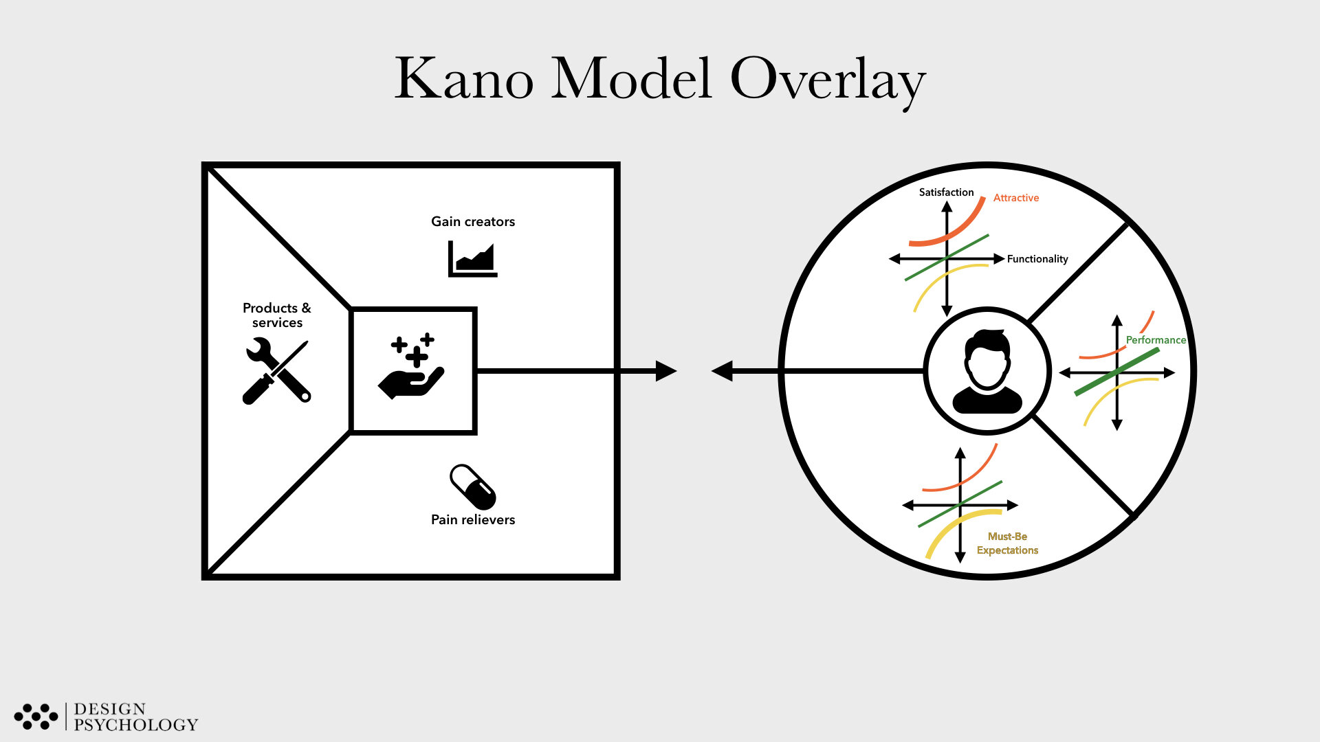
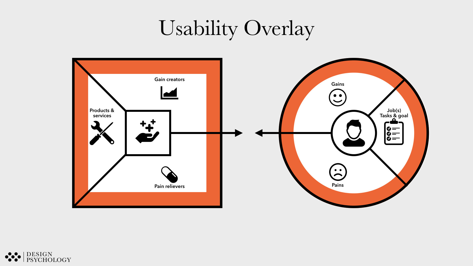
— Value propositions tools should be extended to factor in usability in addition to utility
Finding your Usability features is the first step in being able to use Usability as unique selling points for your product. In the previous two parts of our series on Strategic UX, we have shown how companies fail to realise the full business potential of UX, because their Usability claims lack precision and objectivity. In this third and final instalment of our series on Strategic UX, we dive into concrete operational guidelines you can use to make sure you discover all the Usability problems and features of your product.
Usability in User Insights Studies
For most companies, developing a new product or service starts with identifying an unmet user need. Such unmet needs are often found through User Insights Studies, where users interact with existing products to determine opportunities for further development, or with prototypes to test the viability of future products.
However, such User Insight Studies rarely detect Usability needs, unless it is given special attention. This is due to a number of reasons:
First, users seldom voice Usability needs or issues on their own. This is due to the fact that many Usability problems never reach consciousness because they are often more subtle in nature than, for example, a technical malfunction. So unless something in a task proves to be really difficult, don’t expect users to bring it up themselves.
Second, users tend to take responsibility for poor Usability instead of blaming the product. For example, you may notice that users saying things like:
“I just need to learn…”.
“If I try harder, then it works”.
“It is not the technology that is the problem - it is me”.
These are good signals for undiscovered Usability issues.
Third, users are often skilled at navigating around problematic Usability issues. For example, when we interviewed people about their use of the good old videocassette recorders (VCRs) in the pre-digital TV recording age, most of them were pleased with their device. However, we found that only used the three main functions. The medium to advanced functions were almost newer used. Of course it could be that the other functions were simply not relevant. However, given that the medium and advanced functions were implemented based on User Insight Studies, it seems likely that the users wanted to utilise the other features, but avoided doing so due to poor Usability. In other words, the product had great Usability, but only because the parts with bad Usability was ignored.
Similar to how people will avoid difficult to use functions, we also see how people avoid use situations and contexts that expose shortcomings of the product usability. There are likely products and service that you only will trust in low to medium critical use situations - but not when a lot is at stake. For a long time, I would bring a backup print the boarding pass - just in case the digital App version would fail (again). This narrowing down use contexts is particularly apparent when we engage with people that use healthcare technology. The barrier to use healthcare technologies outside their homes is very often linked to shortcomings in usability that negatively impacts feelings of safety, confidence and control.
So, how do you your ensure that your User Insights Studies manage to capture Usability needs despite this?
Make sure to observe realistic user behaviour. Watching users closely with focus on Usability issues is the first step to determining potential needs. Adding to this, we recommend using video recordings so you can re-watch use situations and share your insights with other stakeholders.
Ask users to use functions or carry out tasks they would normally don’t do themselves.
Explore comfort zones and contexts of use.
Check how robust a the users’ understanding of the product or system is by asking them them explain to you how it works. If users struggle with making a coherent re-telling, they likely experienced Usability problems as well. Stress your users (e.g. introduce a time limitation or distractions). For many products, users perform perfectly in peaceful conditions, but struggle in conditions that resemble daily life.
Usability in Value-Propositions
Once you’ve identified Usability needs, the next challenge becomes to communicate your insights to stakeholders in a convincing and systematic way.
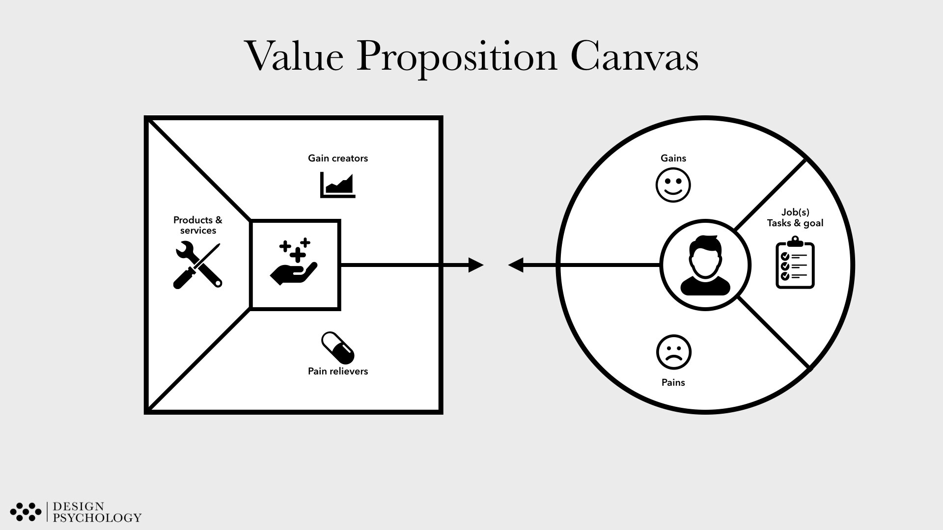
While many tools exist for this purpose, we recommend using the Value Proposition Canvas (VPC), which is widely used tool for communicating user needs as it groups user insights into three useful categories, that map directly to the associated expected value:
Jobs to be done, meaning the actions users need the product for.
Pains associated with the Jobs to be done.
Gains associated with the Jobs to be done.
If we recall the example with the VCRs from above, the medium and advanced functions were designed to accommodate the users' Jobs to be done. However, the poor usability prevented the same users from using them due to the overly complicated design, and so we would list them as a Pain in the VPC. Based on this, it can be shown that the Value of the product can be increased by relieving the Usability Pain associated with using medium and advanced functions.
By working with the in the VPC, you can systematically show how the “Jobs to be done" for your product are either enabled (Gains) or hindered (Pains) by the Usability of the product.
As you work on your VPC, to focus on you will discover both technical and Usability needs. However, for technical needs, remember that it is Usability that enables or realises this potential, for example by allowing users to use the product in less time, with fewer attempts and errors, in more contexts or by more users, as we discussed in part two of this series
Usability in the Design Process
Technical design requirements, especially among engineers, are often specified in a detailed, objective, and measurable manner. That makes for very effective end-points in a design process resulting in less trial and error to get the product working.
For example, technical design requirements for robustness of a handheld device could that it is must survive being dropped
Five times
From an altitude of 3 meters
On a concrete surface
At all angles.
Such a requirement breakdown enables engineers to make initial assessments, for example about the type of materials to use or weigh the pros and cons of different designs. The requirement also informs the design team how to validate the product in a Drop-down test (“Drop the device from three meters onto a concrete surface from different angles”) and defines the test success criteria (“If the device remains functional after being dropped five times, the requirement is met”).
However, detailing Usability design requirements is often way more difficult as more variables are in play that can seldom be reduced to a mathematical formula. However, as we discussed in part two, by being as precise as possible about the desired Usability design requirements, it can nevertheless be possible to give testable goals for the design process.
For example, Usability design requirements for the same single-handheld device could be that an ICU nurse, that has three months of prior experience with a similar product, can:
Carry out the basic daily workflow
Complete tasks with the device without making any user errors.
Achieve the same result in less time than using a competitor's devices.
Operate the device without receiving any additional training.
As with technical design requirements, such Usability design requirements enable designers to make decisions about materials and design by setting a concrete end-goal for the design process. For example, to satisfy the requirement of no additional training, designers would need to investigate the core features of existing products and ensure some similarity in how the device is operated..
Furthermore, as with technical specifications, setting up a Usability test to document that the Usability design requirements are fulfilled would be increasingly easy as they become more precise.
Wrapping up
The purpose of this three-part series was to show how Usability can be used strategically to communicate the business value of your products, and to give guidelines on how to get started with bringing this focus to your products. We will continue posting concrete tools and insights on how we, at Design Psychology, apply knowledge of how humans work to design products and services that are intuitive and effective to use, so make sure to sign up to our newsletter for to get notified on our next series.
If you want to dive deeper into Strategic UX, you can join our master class below or reach out to us.
REFERENCES
Think Like a UX Researcher: How to Observe Users, Influence Design, and Shape Business Strategy (2019). Travis, D. & Hodgson, P. Taylor & Francis.
* * *
Next Steps
Get in Contact
If you want to learn more about the Design Pscyhology approach to design please reach out to:
Director of Strategic Design
Senior Human Factors Specialist, PhD
Rune Nørager
+45 4041 4422


